The standards, systems, and principles that define how Assessed Intelligence appears, reads, and behaves in the world.
This book is a working reference for everyone who creates, reviews, or approves work in the Assessed Intelligence name. It covers identity — what we stand for and how we introduce ourselves — the visual system (logo, color, typography, layout), and the document formats that carry our governance work into the world.
If you're building anything customer-facing or partner-visible, this is your starting point. For anything that isn't covered here, reach out before you ship.
Version Currency
This is Brand Guidelines v2.0, released 2026. All prior versions are superseded. Any working files using pre-v2.0 tokens, type families, or lockups should be brought into alignment before next use.
This is the single sentence that captures what we do and why we're different. It goes where we have one shot to introduce the firm — a website hero, a first-slide deck cover, a door-opener line in a new conversation. It doesn't need a qualifier and it shouldn't be softened.
Campaign tagline
Build Bold.Govern Smarter.
The two-beat campaign phrase that carries the firm's posture into decks, ad units, event banners, and recruiting surfaces. Build Bold speaks to the ambition of clients who are shipping real technology; Govern Smarter names what we do about it. Always together, always in that order, always with the period after each phrase. Acceptable on covers, hero surfaces, and campaign collateral; never used in body copy or substituted for the primary positioning line above.
Web hero · positioning long-form
WEB HERO TREATMENT
High-risk technology creates complex risks — we make governance real, operational, and auditable.
LATO 300 · SENTENCE CASE · EM-DASH SEPARATOR
The longer-form positioning line used on assessedintelligence.com and other web hero surfaces where the audience needs a sentence rather than a slogan. It does the same work as the primary line ("Governance that holds up when it matters most.") but for a reader who has just landed and needs the value proposition in plain language. Use only on web hero / above-the-fold surfaces. Do not pair it with the primary positioning line in the same composition — pick one. Set in Lato Regular, sentence case, em-dash separator (not a hyphen), terminal period.
How to use it
Hero surfaces only. The positioning line earns its weight by scarcity. Don't scatter it across body copy. One placement per page, per deck, per document.
No modifications. Don't shorten it to "Governance that holds up." Don't add "for AI" or "for infrastructure." The strength of the line is in the full cadence.
Companion voice. When the positioning needs a second beat, the character line follows: Forged by Experience · Driven by Purpose · Built to Endure.
Picking the right line
Surface
Use this line
Deck cover · pitch · leave-behind
Governance that holds up when it matters most.
Campaign · ad · banner · recruiting
Build Bold. Govern Smarter.
Web hero · marketing site
High-risk technology creates complex risks — we make governance real, operational, and auditable.
ARISE Framework surface
Evolve and Endure.
Why these lines all end with a period
Look at the four lines — every single one terminates with a period. That's not accidental. Positioning is the firm's first promise; ending each line with a period is the typographic equivalent of this is a statement of fact, no ambiguity.
A period closes the sentence and refuses to leave room for hedging. Compliance brands habitually end with a question mark ("Ready for what's next?") or a colon ("Built for:"). Both invite continuation, both signal openness to interpretation. The brand explicitly rejects that posture. Findings are stated. Controls are named. Consequences are quantified. The period at the end of every positioning line is the same moral commitment, scaled down to a single character.
This connects directly to the red dot in the typographic lockup of the wordmark (slide 04). The dot is the same period, made larger and colored, doing the same work: marking the brand's refusal to deal in approximations.
Assessed Intelligence is a Disabled Veteran-owned consultancy — forged in real-world operations, hardened by missions, and built to help organizations navigate the intersection of cybersecurity, AI governance, and regulatory compliance.
Our mission is to ensure Secure & Responsible Technology. Like the OSS — the U.S. intelligence agency founded during World War II — we were founded on a simple, relentless idea: the challenges of tomorrow will not be overcome by conventional means. Where others see chaos, we see an opportunity to rethink security and ethics from the ground up.
The team
A band of misfits, bold thinkers, technologists, and strategists brought together by a shared commitment to make technology secure, ethical, and equitable from the start.
Deep expertise · diverse backgrounds
The firm is staffed by people who have done the work in places where it had to hold up — battlefield operations, deployed missions, critical-industry incident response, regulated AI rollouts. We're not credential-collectors. We're practitioners with scars. That's what lets us tell a client whether a control will survive the next audit, and whether a governance program will survive the next executive turnover.
What we do
We unify cybersecurity, AI governance, and compliance into one operational program. Four core capabilities anchor the practice — each delivered through our four services on the next slide.
—
Capability
What it means in practice
01
Integrated Risk Management
We unify AI, cybersecurity, and regulatory risk into a single operational framework. Identify exposure early, manage it consistently, and support responsible innovation across complex digital environments.
02
Operational Governance
We translate policy into action. Practical governance frameworks, advisory support, and the kind of day-to-day oversight that ensures responsible AI deployment doesn't drift between board approval and production.
03
Independent Validation
Audits, assessments, and attestation services that confirm compliance, strengthen resilience, and build trust with regulators, partners, and stakeholders. The work that produces documents other parties can rely on.
04
Technical Innovation & Engineering
Proprietary tools, AI technology analysis, and engineer-focused technical reviews. We build the assessment platforms that operationalize the ARISE Framework, analyze emerging AI capabilities and regulatory trajectories, and deliver the engineering-depth review that makes governance programs verifiable end-to-end.
How those capabilities show up in the services
Each capability runs primarily through one of the four services and crosses into others as a supporting discipline:
Capability
Primary service home
Also touches
Integrated Risk Management
Implement — Advisory
Operate, Validate
Operational Governance
Operate — vCISO & vCRAIO
Implement
Independent Validation
Validate — Audit & Attestation
Implement
Technical Innovation & Engineering
Innovate — Solutions & Engineering
Implement, Operate, Validate
What we stand for
Our values are not statements on a wall. They are operating principles — forged through real-world engagements, high-stakes environments, and a relentless commitment to doing the right thing.
VALUE · 01
Integrity
We do the right thing, even when it's not the easy thing. Transparency, accountability, ethical clarity — held to the same standard whether it's a critical audit or an AI risk review.
VALUE · 02
Adaptability
We thrive in the unknown. Born from high-stakes environments and built to operate at the edge of disruption, we adapt rapidly to shifting risks, technologies, and missions so clients stay ahead of what's next.
VALUE · 03
Mission First Dedication
Your mission becomes our mission. Strategic partners, not just consultants — impact over optics, substance over flash, long-term value over short-term wins.
Three values, one posture: do the work, hold the line, deliver outcomes that survive scrutiny. Every engagement, every report, every client conversation is measured against them.
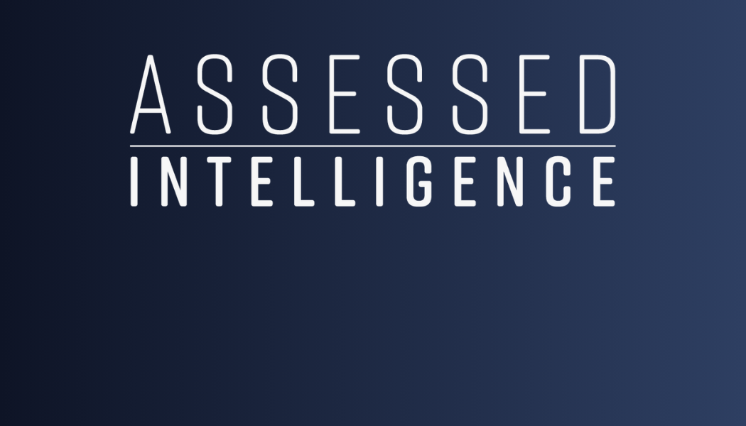
A plain-spoken wordmark. No abstract symbol, no monogram, no brand-name stunt. Just the firm's name, set clearly, with a horizontal rule dividing the two halves.
PRIMARY · WORDMARK ON WHITE01 / 03
The mark is a statement of posture. Governance work doesn't benefit from visual flourish. The wordmark signals steadiness and literal meaning — "Assessed Intelligence" printed with discipline — which is the experience we want clients to have with the work itself.
Why this name
The name does two jobs — each word carries its own weight, and the order matters.
Assessed — the firm's verb. Most consultancies pick a noun for their identity (Strategy. Trust. Insight. Systems.). The verb form is the differentiator. Assessment is a discipline, not a commodity — it's the act of looking at evidence, weighing it against a standard, and rendering a defensible judgment. That's exactly what the firm does: audits, posture reviews, control evaluations, ARISE assessments. The work product is always a judgment based on observable evidence, never an opinion based on vibes.
"Assessed" is also past tense. The work has been done. Not assessing (still in progress) or assess (imperative). The firm doesn't sell the promise of evaluation; it sells the result of it.
Intelligence — the firm's noun. Three meanings stack here, all intentional:
Intelligence as evidence-grounded knowledge — the OSS / national-security tradition the firm explicitly invokes. Information that has been collected, corroborated, and assessed before it's acted on. Not raw data, not opinion, not speculation.
Intelligence as in AI — the artificial intelligence at the heart of "AI governance." Putting Intelligence in the name names the firm's primary subject matter without dating the brand the way "AI Co." would.
Intelligence as cognitive capacity — the firm's product is judgment. Advisors don't just produce documents; they produce thinking that organizations can rely on. Intelligence claims that ground.
Why the order matters.Assessed Intelligence, not Intelligent Assessment. Reverse the order and the meaning flips. Intelligent Assessment would mean "smart evaluations" — adjective modifying noun. The brand becomes about how clever the assessments are.
Assessed Intelligence means "intelligence that has been assessed" — verb modifying noun. The brand is about what survives examination. The information you can act on. The findings that hold up. That's the entire posture of the firm in two words: we don't sell intelligence; we sell intelligence that has been verified.
The thread that connects the wordmark, the dot, and the name
The horizontal rule between "Assessed" and "Intelligence" is the visual encoding of this same logic. Above the line: the act of assessment (what we do). Below the line: the result, intelligence (what you receive). The line is the work itself — the boundary that separates raw input from defensible output. In the typographic fallback where the rule can't be drawn, the Radical Red dot does the same job: a period between the verb that's been completed and the noun that resulted. This has been assessed, no ambiguity.
Variations
The same wordmark on darker grounds. Use these where the surface or composition calls for the brand to anchor a dark field.
VARIATION · ON MIRAGE02 / 03 · #F7F7F7 ON #0E1426
VARIATION · ON IRIDIUM03 / 03 · #F7F7F7 ON #3D3C3A
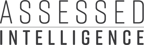
Typographic fallback
For environments where the wordmark image cannot be used — system emails, plain-text signatures, third-party platforms that strip imagery, terminal output, watermarks rendered in a single font — use the typographic fallback. The two words are separated by a Radical Red dot, set inline.
AssessedIntelligence
FALLBACK · TYPOGRAPHIC LOCKUPRIFT 500 · +0.18EM
When to use. Only when the image-based wordmark is impossible. The fallback is functional, not promotional — never use it on covers, hero surfaces, or any composition where the proper wordmark could be embedded instead.
Construction. Both words set in Rift Regular (Oswald 500 fallback), uppercase, letter-spacing +0.18em on each word independently. The dot is Radical Red #FF4B6F, sized to roughly 0.25× the cap height. The dot's margins are asymmetric on purpose — 8px on the left (compensating for the trailing letter-spacing after "Assessed") and 18px on the right. This produces equal optical gutters on both sides. Don't apply letter-spacing to the parent flex container, only to the word spans — otherwise the trailing letter-spacing creates uneven gaps around the dot.
Why the dot
The red dot is a period, not a separator. A comma invites continuation — "and here's the nuance, and here's the qualifier." A period closes the sentence. The dot in the lockup carries the brand's posture in its smallest possible form: this is a statement of fact, no ambiguity.
The firm doesn't deal in approximations or qualified opinions. When Assessed Intelligence renders a finding, it's evidence-grounded and defensible. The dot is the typographic embodiment of that discipline — it says what it says. It also marks the relationship between the two words: Assessed and Intelligence are sequential, not synonymous; intelligence follows assessment. Where the wordmark uses a horizontal rule to express that, the typographic fallback uses the dot.
A circle was the only viable separator. A dash would read as hyphenation; a slash would imply alternation; a bullet would feel listy; a vertical bar would feel like UI chrome. A solid red dot reads as emphasis — the brand's way of saying this matters — without grammatical baggage. It scales from 14px in the typographic lockup to 12px in the compact monogram to 5px in document footers, doing the same work at every size.
Compact monogram
The compact monogram distills the full identity into two letters and a dot — the smallest unit that still carries the brand's meaning. A stands for Assessed: the rigorous, evidence-driven process the firm applies to every engagement. I stands for Intelligence: the insight that emerges only after that process is complete. The Radical Red dot between them is the same period that appears in the wordmark — a declarative full stop that says this is a finding, not an opinion. Together, A·I reads as a single statement of fact: assessment produces intelligence, and the dot closes the case.
Use the compact monogram for favicons, social avatars, app icons, terminal banners, and any 32–128px square where the full wordmark won't read. It carries the same intentional sequence — assessment first, intelligence second, certainty always — at every size the brand appears.
COMPACT · ON MIRAGESOCIAL AVATAR, APP ICON, FAVICON
COMPACT · ON WHITEEMAIL AVATAR, LIGHT BACKGROUNDS
Construction. Letters A and I set in Rift Regular (Oswald 500 fallback), uppercase, no letter-spacing. The dot is Radical Red, sized to roughly 0.08× the cap height. Layout uses a flex row with an 8px gap and the dot's natural margins do the rest — no equal-column grid, since A and I have very different optical widths and forcing them into matched columns pushes them too far apart.
When to use. Use the compact monogram only at sizes 128px square or smaller. Above that, the full typographic fallback or the proper wordmark applies.
Anatomy
Word 1 — Assessed. Set in the brand display face, uppercase, letter-spaced to the open specimen.
Rule. A 1pt horizontal line spanning the full width of the word above. Never thicker, never a double rule, never dashed.
Word 2 — Intelligence. Same face, lighter weight, tighter spacing, smaller body. The subordinate position is intentional — intelligence follows assessment.
Stacked, Title Case, set in Lato on dark ground with a coral terminal period. Used on web hero, campaign openers, and cover surfaces where the tagline carries the composition on its own.
Lockup — formal
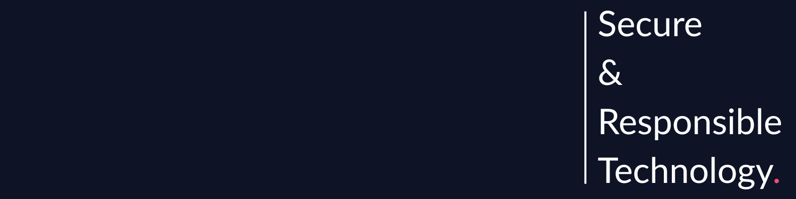
Secure & Responsible Technology
The horizontal lockup. Sits beneath the wordmark in footers, sign-offs, and formal collateral. Always Rift Bold uppercase with a turquoise ampersand (Oswald 700 if Rift unavailable).
Character line — editorial
Forged by Experience | Driven by Purpose | Built to Endure
The firm's character line. Used on editorial surfaces — report sign-offs, document colophons, recruiting materials — where the tone is earned rather than asserted. Never substitutes for the primary.
Rules
Hierarchy. Never stack both primary taglines on the same surface. One per composition; the hero leads on first introduction.
Translation. Taglines are not translated. Both lines remain in English regardless of market or document language.
Punctuation. Primary: ampersand (&). Character line: pipe (|) with hair-space padding. Do not substitute dashes or bullets.
The terminal red period
The hero treatment ends with a single Radical Red period after "Technology." That period is the brand's signature. It is the only color note in an otherwise restrained composition — a Mirage field, Lato Light, no ornament — and it does deliberate work: it tells the reader this is a statement of fact, no ambiguity.
Secure & Responsible Technology. with a period is a declaration. Without it, the line drifts toward marketing aspiration. The firm doesn't aspire to secure and responsible technology — it delivers it. The period closes that distinction.
The same red period appears on the LinkedIn cover banner, on the dot between "Assessed" and "Intelligence" in the typographic lockup (slide 04), and as the terminal punctuation on the campaign tagline ("Build Bold. Govern Smarter."). It's a recurring system element, not a styling choice. Wherever the firm makes a claim it intends to stand behind, the red period appears.
Don't omit it. A tagline without its terminal period reads as a sentence fragment — the brand explicitly rejects that posture. The character line ("Forged by Experience | Driven by Purpose | Built to Endure") is the one exception, since pipe separators do their own punctuation work.
The ARISE Framework — Assurance of Responsible, Innovative, and Secure Environments — is a proprietary seven-pillar governance model and the methodological backbone of our audit and advisory work. It is a distinct sub-brand with its own identity, always presented with attribution.
The wordmark
ARISETMFramework
ARISE WORDMARK · LATO 900 · 6° FORWARD SKEW™ ON FIRST USE
Framework tagline
Evolve and Endure.
The one-line promise of ARISE. Where the firm's positioning speaks to governance that holds up, the framework's own tagline speaks to what makes that possible — a living control set that adapts as AI, regulation, and risk evolve. Used on the framework cover, ARISE Explorer surfaces, pillar-introduction decks, and certification collateral. Always terminal with a period, always presented in Rift (or Oswald fallback), never substituted for the primary Assessed Intelligence positioning.
The seven pillars
Govern · Manage · Identify · Protect · Detect · Respond · Validate. A continuous, interdependent assurance cycle. 128 controls and 889 control requirements distributed across the seven pillars. Each pillar carries its own color in the ARISE Pillar Palette (slide 17).
Govern
01
Manage
02
Identify
03
Protect
04
Detect
05
Respond
06
Validate
07
SEVEN PILLARS · CONTINUOUS ASSURANCE CYCLE
Sub-brand rules
Always attributed. First mention on any surface includes the ™ mark and, when space allows, "by Assessed Intelligence." Subsequent mentions can drop the attribution.
6° skew. The ARISE wordmark is set at a 6° forward skew — the sub-brand's single geometric signature. Never apply the skew to the Assessed Intelligence wordmark or to any other element.
Own the domain. Framework documentation lives at ariseframework.com. Deep links from Assessed Intelligence surfaces are fine; embedding framework content under our domain is not.
Four named disciplines. Every engagement maps to one or more — and every page on assessedintelligence.com organizes around this structure.
01
Implement
Scoped advisory service to deploy programs, capabilities, or implement programs — defensible when it counts.
ADVISORY
02
Operate
Strategic leadership and expertise embedded with client teams to operationalize their programs and scale their abilities.
vCISO & vCRAIO · RETAINER SERVICES
03
Validate
Audit and attestation services that provide independent validation of an organization's controls — building stakeholder trust.
AUDIT & ATTESTATION
04
Innovate
Proprietary tools, AI tech analysis, and engineer-focused technical reviews.
SOLUTIONS & ENGINEERING
FIXED ORDER · THIRD TILE ACCENTED IN RHINO
Discipline
Sub-label
What it covers
Implement
ADVISORY
Scoped advisory service to deploy programs, capabilities, or implement governance frameworks. Project-based engagements with clear deliverables — targeted regulatory alignment, control build-out, and audit preparation for AI and cybersecurity programs that must be defensible when it counts.
Operate
RETAINER SERVICES
Strategic leadership and expertise embedded with client teams to operationalize their programs and scale their abilities. Senior cybersecurity, AI governance, legal, and ethical specialists integrated into the client organization without the cost or commitment of full-time hires. Anchored by vCISO and vCRAIO roles.
Validate
AUDIT & ATTESTATION
Audit and attestation services that provide independent validation of an organization's controls — building stakeholder trust. Third-party assessment for AI governance, cybersecurity, and regulatory compliance, producing the verified evidence that regulators, auditors, and investors require.
Innovate
SOLUTIONS
Proprietary tools, AI technology analysis, and engineer-focused technical reviews — producing technology solutions that organizations can deploy with confidence and defend under scrutiny. ARISE is the anchor product of this track.
Capabilities under each service
Every capability on the site maps to one of these four services. Partners referencing a specific service should use the canonical sub-label ("Implement · Advisory", "Operate · Retainer Services") rather than the discipline name alone, to avoid confusion with the capability name.
Use the exact service names as shown, in the exact order: Implement · Operate · Validate · Innovate. Don't reorder for narrative convenience (e.g. leading with Validate because an engagement is audit-heavy). Don't substitute synonyms — "Assurance" is not a synonym for Validate; "Advisory" is the sub-label for Implement, not its replacement. When referencing the whole model in body copy, call it the Service Architecture — never "our four services" or "the four pillars" (pillars belong to ARISE).
Four pillars that together describe how the firm talks on the page.
Authoritative
We assess, recommend, and stand behind it. Hedging language (might, could, in some cases) is used only where it's technically warranted, never as a defense mechanism.
Disciplined
We write with structure. Claims are separated from caveats; evidence is cited; conclusions are numbered. The shape of the document reflects the shape of the thinking.
Measured
We don't alarm, oversell, or perform. Governance work loses trust the moment it sounds like marketing. Calm over dramatic.
Humane
We write for the reader across the table. Jargon is used when it's accurate, unwound when it's not. The goal is clarity, not credentialing.
Test
Before shipping any external writing, read it aloud. If a sentence wouldn't survive being read to a client's CEO in a room, rewrite it.
Six principles that govern how Assessed Intelligence writes. Each one is paired with a "weak" example you'll see in the wild and a "strong" rewrite that matches the firm's voice.
1. Lead with the finding
Every report, memo, and section opens with the conclusion. Readers should be able to stop after the first paragraph and know our position.
DON'T
"This report covers our recent assessment of the AI governance program. We reviewed several controls and identified some areas of concern. Our findings are presented below..."
DO
"The AI governance program does not meet ISO 42001 readiness. Three controls are absent, two are documented but not operating, and one is operating outside its stated scope."
2. Cite or don't claim
If a statement could be challenged, it needs a citation — to a control, a document, a log, or a named source. Unsupported assertions are noise.
DON'T
"The model has shown signs of drift in recent months and may be operating outside its intended performance envelope."
DO
"Accuracy on the production model has fallen 12% since deployment (monitoring log, 14 Mar – 22 Apr 2026), exceeding the 5% drift threshold defined in Control AI-MON-03."
3. Numbers over adjectives
"76% of controls implemented" beats "most controls implemented." When we can't quantify, we say so plainly rather than reaching for superlatives.
DON'T
"Significant progress has been made on the governance roadmap. Most of the high-priority items are now in good shape."
DO
"18 of 24 high-priority roadmap items are complete (75%). Six are in flight; none are blocked. Target close: 31 Aug 2026."
4. Name the reader
Every document has one audience. Write to them — CISO, auditor, board, engineer — and don't split the difference.
DON'T
"This document provides an overview of our findings for various stakeholders including technical and business audiences."
DO
"For the audit committee: the program is on track for ISO 42001 certification by Q3. Two findings require board awareness; both are documented in §4."
5. No passive escape hatches
Avoid "it is recommended that" and "concerns have been raised." Name who is recommending and who is concerned.
DON'T
"It is recommended that the model be retrained, and concerns have been raised regarding the bias evaluation methodology."
DO
"Assessed Intelligence recommends retraining the model on the 2026 dataset. The DPO has flagged the bias evaluation methodology as inconsistent with the firm's RAI policy §3.2."
6. Short paragraphs
Dense prose hides weak thinking. Each paragraph carries one claim and its support.
DON'T
"While we acknowledge that significant progress has been made in addressing several of the previously identified gaps, particularly around documentation and incident response, there remain several areas where further work is required, including but not limited to model monitoring, supplier risk management, and the integration of AI risk into the broader enterprise risk framework, all of which we will detail in subsequent sections."
DO
"Documentation gaps from the prior assessment are closed. Incident response now meets the policy.
Three areas remain open: model monitoring, supplier risk, and AI-to-enterprise risk integration. Each is detailed in §3."
The test
Before sending any document, ask: could a senior partner read just the first paragraph and know what we found, what we recommend, and who needs to act? If not, the lead is buried — rewrite.
A two-word wordmark split by a horizontal rule. Set in the brand display face.
PRIMARY · ON DESERT STORM
The logo is the most frequently reproduced artifact in the system. Its authority comes from repetition, not from elaboration — which is why there is no graphical mark, no monogram, no shield, no lockup-with-tagline primary. Just the wordmark.
Construction
Top word
ASSESSED — uppercase, display face, letter-spacing 0.02em, cap height = X
Rule
1pt horizontal line, width = top word width, color inherits from context
Bottom word
INTELLIGENCE — uppercase, display face, letter-spacing 0.22em, cap height ≈ 0.48 × X
Source file convention
Always reach for the vector master (.svg or .ai). Raster exports (.png) are for specific placements and are not acceptable in print above small logo sizes.
Default. Use anywhere the surface is white or Desert Storm.
Reverse — White
White on dark
Dark surfaces, photo overlays, Mirage backgrounds.
Rhino
Navy on light
When the primary feels too heavy and the surface is a pale neutral.
Mono — Black
Black on any
Newspaper, single-ink print, fax-era fallback.
What's not a variant
Color variants (turquoise wordmark, red wordmark) do not exist. Gradient versions do not exist. Drop-shadow versions do not exist. If a variant isn't in the asset library, it's not approved.
The exclusion zone around the logo equals the cap height of the word ASSESSED (X). No competing type, imagery, or rule may enter this zone — including other logos, partner marks, page edges, and UI chrome.
X
X
X
X
CLEAR SPACE = CAP HEIGHT OF "ASSESSED"
Minimum size
Medium
Minimum width
Digital
160 px wide
Print
1.25 in wide
Below these thresholds, the horizontal rule in the wordmark collapses visually. Use a full-size lockup in supporting collateral, favicons, or reduce the mark only where required by the medium.
The same content rendered three ways — Desert Storm paper, Mirage dark, and Rhino navy. The hierarchy holds across all three because the primary palette is engineered to do exactly this work.
04 · SECTION
Defensible by Design
Mirage type sits cleanly on Desert Storm. The default surface for paper and document interiors.
PAPER · #F7F7F7MIRAGE TYPE · ASH RULE
04 · SECTION
Defensible by Design
Desert Storm type on Mirage. The cover treatment for hero surfaces, decks, and section breaks.
DARK · #0E1426DESERT STORM TYPE
04 · SECTION
Defensible by Design
Desert Storm type on Rhino. The branded panel treatment — lighter than Mirage, still authoritative.
NAVY · #2E3F62DESERT STORM TYPE
What the primary palette doesn't carry
Look at the four primary colors and what's missing — emotion. Mirage, Rhino, Desert Storm, and Ash Grey are the firm's architecture: they hold the type, the surfaces, and the rules. None of them speak. None of them assert.
That's deliberate. The primary palette is meant to be steady and quiet so the rare moments of red — the terminal period on the tagline, the dot between "Assessed" and "Intelligence," the status indicators on document covers — can do their work without competing for attention. Red carries the brand's signature posture: this is a statement of fact, no ambiguity. The full rationale is on the Accents slide. Here, the takeaway is that the primary palette earns its weight by saying nothing emotional, so the accent palette can.
Two deep-tone neutrals that expand the ink range without introducing color temperature shifts.
Iridium
#3D3C3A
Body-text ink on light surfaces. Warmer than Mirage, more readable at small sizes.
Thunder
#33292F
Rich warm near-black. Editorial body type on warm document surfaces, headlines that need a softer landing than Mirage. Carries a slight maroon undertone — reads warmer than Iridium.
Side-by-side
Iridium is cool; Thunder is warm. The same composition rendered on each shows the difference plainly — both work as dark surfaces, but they don't read interchangeably.
EDITORIAL · LONG-FORM
A Considered Position
Iridium reads cool and analytical. Use for body type and editorial backgrounds where the content is technical or evidence-heavy.
IRIDIUM · #3D3C3ACOOL DARK · ANALYTICAL
EDITORIAL · LONG-FORM
A Considered Position
Thunder carries a warm undertone. Use for editorial covers, recruiting materials, and documents where the firm wants to feel less clinical.
THUNDER · #33292FWARM DARK · EDITORIAL
When to use which
Use case
Iridium
Thunder
Body type on light
Default for technical and audit content
Avoid — warm undertone reads off-brand at body scale
Dark surface for body copy
Long-form technical reading
Editorial covers, recruiting
Headline color
When pairing with neutrals only
When the document mood is editorial, not technical
When in doubt, use Iridium. It's the safer pick for the firm's default voice — analytical, technical, evidence-grounded. Thunder is the deliberate exception, not the equal alternative.
Affirmative. Active states, key callouts, the ampersand in the tagline, success indicators.
Radical Red
#FF4B6F
Critical signal. Metric callouts, restricted/admin markers, the terminal period on the Hero tagline. Reserved — never decorative.
Discipline
Radical Red is always intentional. A stray accent-color border or button on an otherwise neutral surface is a style drift, not brand. When in doubt, leave it out.
Accents in use
Three small specimens showing the accents doing exactly the work they're allocated. Each occupies a fraction of the surface; remove the accent and the composition still reads.
ARISE FRAMEWORK
Audit-Ready Evidence
Continuous control evidence keeps the program defensible.
Read more ↗
TURQUOISE · ACTIVE LINK~5% OF SURFACE
REPORT · 01
CONFIDENTIAL
ASSESSMENT REPORT
AI Risk & Control Review
RADICAL RED · STATUS DOT<1% OF SURFACE
Secure & Responsible Technology.
RADICAL RED · TERMINAL PERIOD<1% OF SURFACE
Style drift vs. correct use
The same composition on the left has the accent doing too much; on the right, the accent does its single job. Both surfaces use Radical Red — one earns the color, the other doesn't.
×
RISK FINDING
Model Drift Exceeds Tolerance
DON'T · STYLE DRIFT
RISK FINDING
Model Drift Exceeds Tolerance
HIGH RISK
DO · ACCENT DOES ONE JOB
Why Radical Red carries the brand's signature
Of all the colors in the system, Radical Red is the only one tied to consequence. Mirage and Rhino carry architecture; Desert Storm is paper; Iridium and the secondary neutrals quietly structure information; Turquoise is technical — the "this is alive" indicator on dark surfaces. Red is human. It's the color the brand uses when something matters.
That's why a single red dot, used sparingly, becomes the brand's most recognizable signature. The terminal period on Secure & Responsible Technology. The dot between "Assessed" and "Intelligence" in the typographic lockup. The status marker on document confidentiality lines. In each case the red is doing the same job: this is a statement of fact, no ambiguity.
Because the firm refuses to deal in approximations or qualified opinions, the brand needs one color that says so visually. Capping Radical Red at ≤2% of any composition isn't restraint for restraint's sake — it's what makes the dot read as a declaration rather than as decoration. If red shows up everywhere, it stops meaning anything. That's why the discipline matters.
Seven colors — one per ARISE pillar. Used exclusively when labeling, categorizing, or visualizing the framework itself.
Govern
#2E3F62
Deep navy. Strategy, accountability, oversight, and policy structures. Pairs with Mirage — use the darker value (Mirage) for body text on light backgrounds, Govern for pillar tokens and callouts.
Manage
#DD8452
Coral orange. Risk management processes, lifecycle governance, and issue handling. High contrast against white; use on pillar badges, diagram nodes, and data-viz categorical fills.
Identify
#5F885A
Sage green. Asset visibility, inventories, dependencies, and classification. The muted sibling to Protect — use when both pillars appear in the same view and need visual separation.
Protect
#7CB579
Fresh green. Safeguards, access control, security protections, and privacy controls. The brightest of the two greens — use for the primary Protect pillar badge and for affirmative protection indicators.
Detect
#8A86C8
Periwinkle. Monitoring, anomalies, drift, threats, and control failures. The observational color — signals watchfulness without alarm.
Respond
#D56062
Rose. Escalation, corrective action, recovery coordination, and incident handling. A muted red — intentionally softer than Radical Red, which remains reserved for critical UI signal only.
Validate
#4A8087
Teal. Testing, evidence, assurance, audit readiness, and independent review. The closing pillar color — reads as both authoritative and complete.
Rule of use
ARISE pillar colors are framework-specific. They appear on ARISE Explorer (ariseframework.com), pillar tokens, domain diagrams, audit reports that map findings to pillars, and ARISE-branded marketing surfaces. Do not mix with the Primary or Secondary palettes as decorative fills — a coral tile next to a Desert Storm card reads as off-brand. If you're not labeling a pillar, use Mirage / Rhino / Desert Storm instead.
Usage examples
Pillar badges: small rounded pills with the pillar name in white, background = pillar color. Accent underlines: 4px colored bar along the bottom of domain tiles (see Partner Hub). Diagram fills: use at full saturation for categorical nodes; lighten to 15% alpha for background zones. Never on body text, never in the logo, never in the Certification Mark.
The condensed, industrial display family that carries the Assessed Intelligence wordmark, slide titles, section labels, and metric callouts. Uppercase only, with a disciplined letter-spacing.
Defensible.
Rift · Display · Industrial
96PT · +0.02EM
RIFT 500 · HERO SPECIMEN · ON PAPER
Character set
Aa Bb Cc
1 · 2 · 3 · 4 · 5
Headline specimens
Secure by Design
Assessed · Verified · Documented
Defensible Decisions
Weight comparison
LIGHT · 300
Intelligence
REGULAR · 400
Intelligence
BOLD · 600
Intelligence
Use
The wordmark. "Assessed / Intelligence" is set in Rift — hairline weight over regular, divided by a single horizontal rule. This is the primary expression of the brand and appears on every cover, letterhead, and formal surface.
Web. Hero heads, slide titles, positioning statements. Body headers on web stay in Lato display weights — Rift is reserved for hero-level and wordmark emphasis.
Weights
Rift Regular (400) is the default display weight. Rift Bold (700) for metric big-numbers and high-emphasis headlines. Rift Light (300) only appears in the wordmark itself, where "ASSESSED" is set in Light over "INTELLIGENCE" in Bold.
Secondary display · Oswald
When Rift is not available — licensed seat not installed, third-party collaborator, urgent turnaround without access — Oswald (Google Fonts) is the only acceptable substitute. Oswald and Rift share the same condensed industrial posture, letterforms, and uppercase discipline. No other display substitute is permitted. Do not use Oswald when Rift is available. Do not mix Rift and Oswald in the same document.
Licensing
Rift is licensed from TypeTogether. Partners requiring production-quality materials featuring the Assessed Intelligence wordmark must either purchase a Rift seat or request a rendered master from marketing@assessedintelligence.com. Partners producing collateral at speed without Rift must use Oswald — never Arial Narrow, Impact, Bebas, or other condensed substitutes.
The humanist sans-serif that carries body copy, long-form reading, and most of the web interface.
Lato is a warm, readable workhorse. It holds body copy over long reading sessions, handles UI labels without looking industrial, and pairs cleanly with Rift by staying out of its way.
Pull-quote scale
A measured approach to securing modern systems.
Weight specimens
LIGHT · 300
The quick brown fox
Lead paragraphs, oversized display body.
REGULAR · 400
The quick brown fox
Body copy default. Long-form reading.
BOLD · 700
The quick brown fox
Inline emphasis, table headers, callouts.
BLACK · 900
The quick brown fox
Short labels where Rift would be too industrial.
Weights
Weight
Use
Lato 300 (Light)
Lead paragraphs, hero subheads, oversized display body.
Assessed Intelligence advises executives, boards, and legal teams on systems where failure carries legal and ethical consequences. All guidance is grounded in assessment evidence and defensible reasoning.
Non-type elements that repeat across the system and carry brand recognition on their own.
Frame with corner ticks
A 1pt Rhino rectangle with small tick marks at each corner. Can be used on document pages, deck slides, and feature cards — an optional structural treatment, not a required one. When applied, the ticks are structural punctuation, not decoration: always the same size, always aligned to the rule.
FRAME · 1PT RHINO · 12PX TICKS
Document page or deck slide content
FRAME · SPECIMEN
Rules & dividers
1pt Rhino or Ash Grey, depending on contrast. Never 2pt+, never dashed, never gradient. Section breaks use a short 80px Rhino bar.
1PT RHINO · FULL-WIDTH
1PT ASH GREY · FULL-WIDTH
SECTION BREAK · 80PX RHINO BAR
Red dot bullets
Small 6×6px Radical Red squares for list items. A list with more than one red-dot item is rare — use sparingly; for longer lists use default bullets.
The single most important finding in an audit report.
Any second item that's nearly equal weight.
Metric cards
White card with a 4px Radical Red top border and a large Rift Bold (or Oswald 600 fallback) number. Reserved for signature statistics (e.g., the 128 controls metric). Don't populate with minor figures.
The standard-issue card for every Assessed Intelligence representative. Fill in your details below to preview your card; download a PNG of the front for print vendor requests or digital sharing.
First Last
Role / Title
+1 234 327-2803
Sales@assessedintelligence.com
FRONT · LIVE PREVIEW1050 × 600 PX
Downloads a 300 DPI PNG with both sides, 0.125″ bleed, and crop marks — print-vendor ready.
CARD DETAILS
For print production
The downloaded PNG is print-vendor ready — 300 DPI, both sides, 0.125″ bleed, crop marks. Send it directly to your preferred print vendor, or email to marketing@assessedintelligence.com for central ordering on brand-approved stock. Vendor note: file is RGB (sRGB); most vendors handle RGB-to-CMYK conversion automatically, or request a CMYK proof before press.
Card back
The reverse of every card. Centered wordmark on Mirage-to-Rhino gradient. Not customized per person.
BACK · WORDMARK SIDE
Front specifications
Element
Spec
Name
Lato 900 (Black) · Mirage · sentence case, not caps
Title
Lato 900 (Black) · Radical Red · sentence case
Rule
1pt Mirage horizontal line, spanning the full card width
Contact icons
Filled Mirage circles, white glyph (phone, envelope) — 28×28pt
Contact text
Lato 400 · Mirage · phone as written, email as written
Bottom band
Mirage fill, full-bleed; "Secure & Responsible Technology." in Lato 700 white centered; URL below in Lato 400 white
Print specs
Attribute
Value
Trim size
3.5" × 2" (US standard) · 85mm × 55mm (EU)
Bleed
0.125" (3mm) on all sides
Safe area
0.125" (3mm) inside trim — keep all text inside
Stock
32pt uncoated matte, natural white · preferred · or 16pt silk lamination
Ink
Full-color CMYK both sides · no spot colors · no foil
Partner organizations producing co-branded collateral do not receive Assessed Intelligence business cards. Partners use their own card design with their own name and title, and may reference the Assessed Intelligence partnership in their own company materials per the co-branding rules on slide 06. The Certification Mark (slide 25) may appear on a partner's card only if the partner has completed the ARISE certification process.
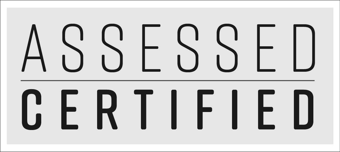
The graphical seal we grant to audited-and-validated partners. A distinct artifact from the primary wordmark, used only by authorized third parties.
CERTIFICATION MARK · OFFICIALASSESSED · CERTIFIED
Who may use it
ARISE Control Partners at the Preferred (Vetted) tier and any audited client whose engagement has concluded with a passing attestation. Authorization is time-bounded — the mark carries a vintage year.
How it's used
On the partner's own surfaces: website trust bar, product page, sales one-pager, investor deck. Always with "Assessed by Assessed Intelligence" wordmark beneath, and always at or above the minimum size in the certified-mark spec.
What's not permitted
No recoloring, no resizing of elements within the mark, no placement that implies a broader relationship than the audit scope.
Authorization
All uses of the certification mark require written confirmation from marketing@assessedintelligence.com. The mark is controlled artwork — partners receive an approved master file when authorized; no other version may be reproduced.
All three share the same cover (Mirage background, wordmark top-left, title in Rift, ID in Mono, vintage year), the same frame-with-ticks page system, and the same three-line centered footer.
Footer
Standard footer
Assessed Intelligence · AI-AUD-2026-0001
Secure & Responsible Technology.
Forged by Experience · Driven by Purpose · Built to Endure
Templates and working files live in the Brand Kit's Resources section. Don't start a document from a blank — always fork the master.
The brand reduced to pixels: LinkedIn, email, Google Workspace, and the handful of places where we're measured in 40×40px icons.
LinkedIn cover
LINKEDIN COVER · 1584 × 396 PXPRODUCTION ARTWORK
Mirage field with the brand promise — Secure & Responsible Technology. — right-aligned in Lato Light, separated by a thin vertical rule. The trailing red dot is the only color note. The left two-thirds stays clear so the profile avatar overlap doesn't collide with content.
Profile avatar & small-format marks
PROFILE AVATAR400 × 400 · LINKEDIN, GOOGLE
LIGHT AVATAREMAIL, DOCS
FAVICONCOMPACT MONOGRAM · 32 × 32
Email signature
Name, title, Assessed Intelligence, then phone if relevant, then one link (assessedintelligence.com). No quote, no tagline, no banner image.
Favicon and small-format
Where a square format is forced (favicon, Slack logo, app icon), use the compact monogram — A · Radical Red dot · I — on Mirage. Full construction is documented on slide 04 (The Mark). The full two-word wordmark does not scale below the minimum size in these places, but the monogram does — cleanly down to 32×32.
A brand doesn't stay disciplined by accident. Somebody owns it, somebody approves new uses, and there's a clear path for proposing changes.
Brand custody
The Marketing & Leadership team owns the system and the asset library. New assets, new lockups, new applications go through them before deployment.
Version control
Guidelines are versioned on a calendar cadence (currently v2.0, 2026). Between versions, additions are published as appendices in the Brand Kit. Contradictions are resolved by the most recent artifact — the Brand Kit app is the source of truth.
Asking questions
For anything that isn't covered in this document, reach out before you ship. A 2-minute conversation beats a week of rework.

